
Victorian diaries, changing mastheads and two magazines sharing one name: a collector’s look at Park Lane.
A sister magazine with an intriguing name
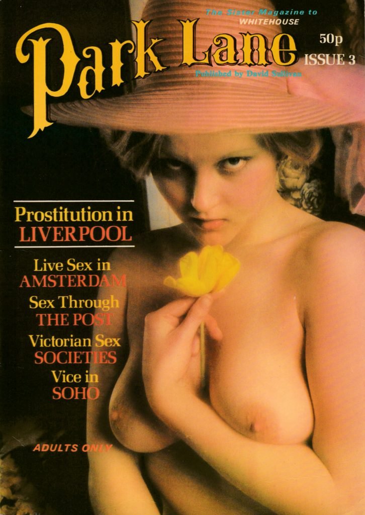
Launched by David Sullivan in 1975, following Whitehouse’s debut in 1974, Sullivan billed Park Lane as Whitehouse’s sister magazine. But was its name also a cheeky nod to Mayfair?
The connection is certainly tempting. Mayfair and Park Lane are the two most expensive properties on the standard UK Monopoly board, sharing its prestigious dark-blue colour group. In London, Park Lane forms the western boundary of Mayfair, where the district meets Hyde Park.
For a magazine entering the 1970s publishing market, the name evoked luxury hotels, high society and a certain “top-of-the-board” prestige. Whether this was a deliberate reference to Mayfair magazine is open to interpretation, but it is an appealing possibility.
Victorian promises
The editorial in the first issue set out Park Lane’s intentions, promising “THE FINEST VICTORIAN STYLE EROTICA”, “THE VERY BEST IN MODEL PHOTOGRAPHY – specialising in Sexy underwear pics.” and “SWINGING BRITAIN IN THE SEVENTIES – an uncensored look at the usually taboo topics.”
Alongside these promises, Sullivan set out a strongly anti-censorship stance, urging readers to write to their MPs in support of the magazine’s campaign to change the law.
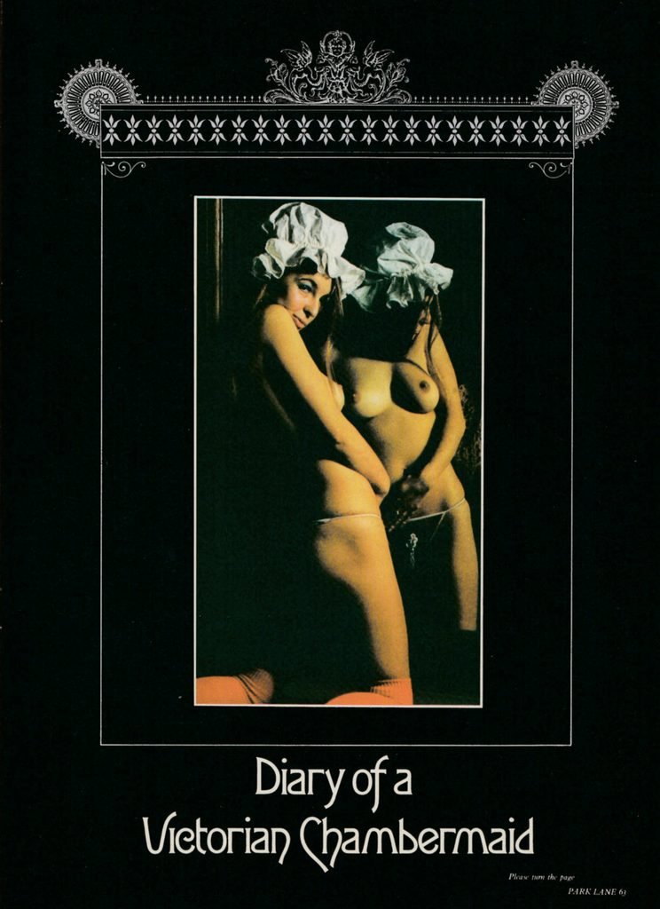
That issue also introduced Diary of a Victorian Chambermaid, a serialised collection of “confessions”. According to the magazine, these had been discovered in the cellar of a small boarding house in London’s East End. Apparently written by a woman who had recently died. The documents were said to have been sold exclusively to Roafield Publishing Limited, named in the first issue’s imprint.
Park Lane’s distinctive masthead combined Victorian exuberance with colourful carnival splendour: an invitation to curious top-shelf browsers to discover the pleasures within its pages.
Mary Millington and the return of Victorian erotica
By issue 5, both the Victorian-style erotica and the emphasis on underwear photography had disappeared, although the articles about swinging Britain remained. The same issue featured Mary Millington adorning the cover and a four-page pictorial. That month, she appeared in both Whitehouse No. 7 and Private issue 22, further establishing her presence across Sullivan’s magazines.
Despite the shared surname, Mary and editor Doreen Millington were not related https://www.marymillington.co.uk/?p=4135, a useful reminder that the stories surrounding these publications can be as colourful as their covers.
Victorian erotica returned in issue 10 with Diary of a Victorian Lady About Town. This was presented as the work of Maud Chantry Whitfield de’Clancy, taken from a red leather diary discovered during the demolition of a Victorian house in the 1920s.
The claimed provenance is difficult to verify. Whatever its origins, the feature did at least bring back one of Park Lane’s original promises.
An editor with a point to make
Issue 11’s editorial featured “Sexy Editor” Doreen Millington in Welsh national dress, posing as a female Guy Fawkes with a theatrical bomb.
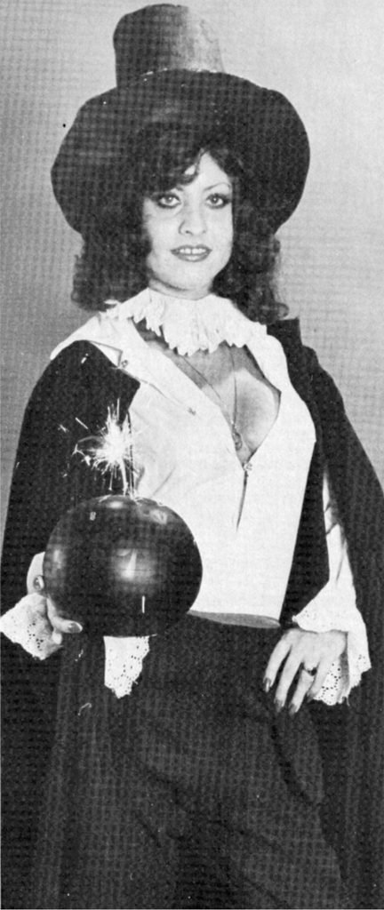
The text explains that Doreen’s parents were Welsh, as was publisher David Sullivan. It complained that the police were giving both Park Lane and Doreen “so much trouble”, presenting her as a parody of the bombers they should really be pursuing.
The editorial itself reported previous “skirmishes” with the police and the loss of 96,000 copies of one issue. Crucially, it also stated that, at the time of going to press, the magazine had never been charged with anything. Readers were again urged to support its campaign by writing letters.
Together, the photograph and editorial show how Park Lane combined provocative humour with its campaign against censorship and police intervention.
The changing face of Park Lane
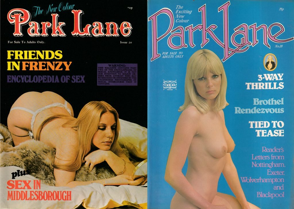
By issue 17, the magazine adjusted its masthead, moving from an arched arrangement to a straight one while retaining its recognisable decorative lettering. Above it appeared the lavishly styled proclamation “The New Colour”.
Within a year, the masthead changed again. From issue 28, it had adopted a more modern 1970s aesthetic, remaining equally bold while the accompanying slogan became “The Exciting New Colour”.
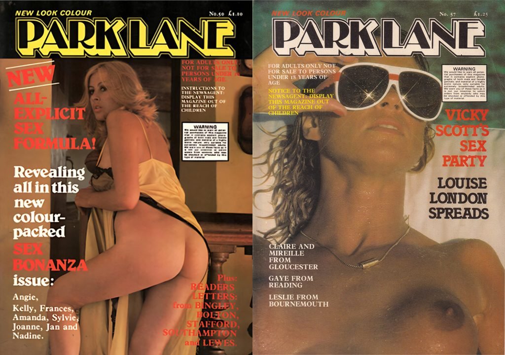
By issue 50 in 1979, the masthead had changed again. Adopting angular, block-style lettering under the banner “New Look Colour”. The same design remained in use on issue 57 and subsequent covers through to the end of the original run.
As far as we have been able to ascertain, the original Park Lane continued until 1983, reaching issue 98. We have yet to find a later issue from this run.
Another Park Lane enters the picture
The story becomes more complicated in 1986, when Gold Star Publications launched another magazine called Park Lane. This time, it was promoted as the sister magazine to Parade, a description clearly displayed on the first issue’s cover.
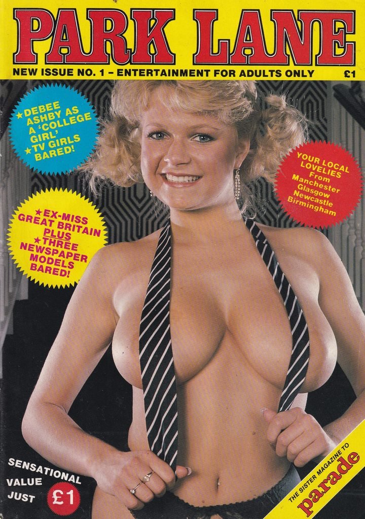
Whether this echoed Sullivan’s earlier approach is unclear. The later title’s final publication date is also difficult to establish. We can confirm that it reached issue 67 in 1994 as we have a copy of that issue. We have yet to find a later issue from this run.
For collectors, the masthead provides a useful first clue to which Park Lane they are looking at. However, because the original title changed its lettering several times, the publisher’s details and publication date are more dependable ways to distinguish the two runs.
Two magazines, one name, and plenty of changing styles: Park Lane offers a fascinating piece of British top-shelf history to explore and collect.
Browse out Park Lane collection here.